A month after going live with Nuxt, the site was holding up under load. A harder question remained: was it pleasant to use on a phone?
The first weeks of data answered without ambiguity. On mobile, the checkout was losing customers at the shipping and payment steps. Nothing was broken: orders went through, tests passed. But when we walked through the journey on an iPhone 12, we saw what dashboards don’t tell you. The button to validate the cart only appeared after scrolling. On the payment step, the terms checkbox and the confirm button were buried under the sections already filled in.
This article covers two workstreams we ran in parallel from March 2026: removing friction from the mobile checkout, and improving our Core Web Vitals. The first is played out pixel by pixel, the second millisecond by millisecond, and both follow the same rule: measure on a real phone before believing anything.
Seven quick wins, one constraint
We set ourselves a tight constraint: template and CSS only, no backend change, and nothing that would break the existing desktop design. Everything goes through Tailwind’s responsive prefixes (max-lg: and lg:) to isolate mobile.
We listed the pain points by expected impact, then worked through them in that order:
| # | Quick win | What changes |
|---|---|---|
| 1 | Visible cart CTA | The “Validate my cart” button appears below the items, and sticks to the bottom of the screen until you scroll down to it |
| 2 | Sticky payment CTA | Terms checkbox and confirm button in a fixed footer, except for Apple Pay which has its own native button |
| 3 | Spacing | Gaps between sections go from 32 to 16 px on mobile |
| 4 | Collapsed sections | Completed steps fit on one line with an “edit” link |
| 5 | Headings | Less padding above each step’s title |
| 6 | Forced scrolling | Removed an automatic scroll to the billing address that disoriented users |
| 7 | Summary | Item thumbnails in the mobile summary, with a “+2” when there are more than three |
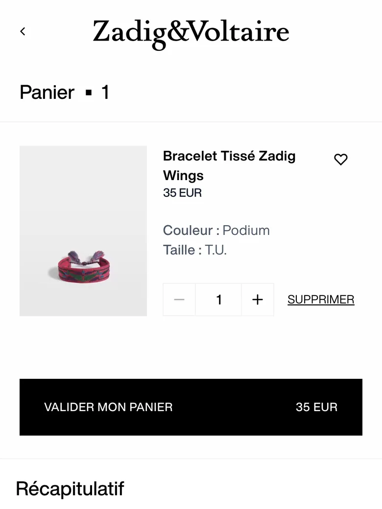
Quick win number 2 took the most care. A sticky footer on mobile is simple until it meets payment methods: card, Alma and PayPal go through our button, Apple Pay through its own. So the footer has to appear or disappear depending on the selected method, and the terms validation has to show its error inside the footer itself, where the customer is looking.
User acceptance testing surfaced what no mockup would have shown: text still too small on an iPhone 12 while it was fine on a 13 Pro, an “edit” link that led to the delivery method instead of the address, details asked for again after creating an account. Everything was fixed before the production release on 2 April.
These quick wins were part of a broader series of adjustments. In March, payment logos had already been grouped on a single row, and the delivery method had gained a dedicated step, with a proper button to continue from the pickup point map. At the end of April, one last change moved the cart summary to the top of the mobile checkout, as an in-page accordion rather than an overlay. The thumbnails morph between the collapsed and expanded states through the View Transitions API: the browser interpolates the positions itself, with no animation library.
The free shipping meter
In the same spirit of reassurance, since June the mini cart shows a progress bar towards free shipping.
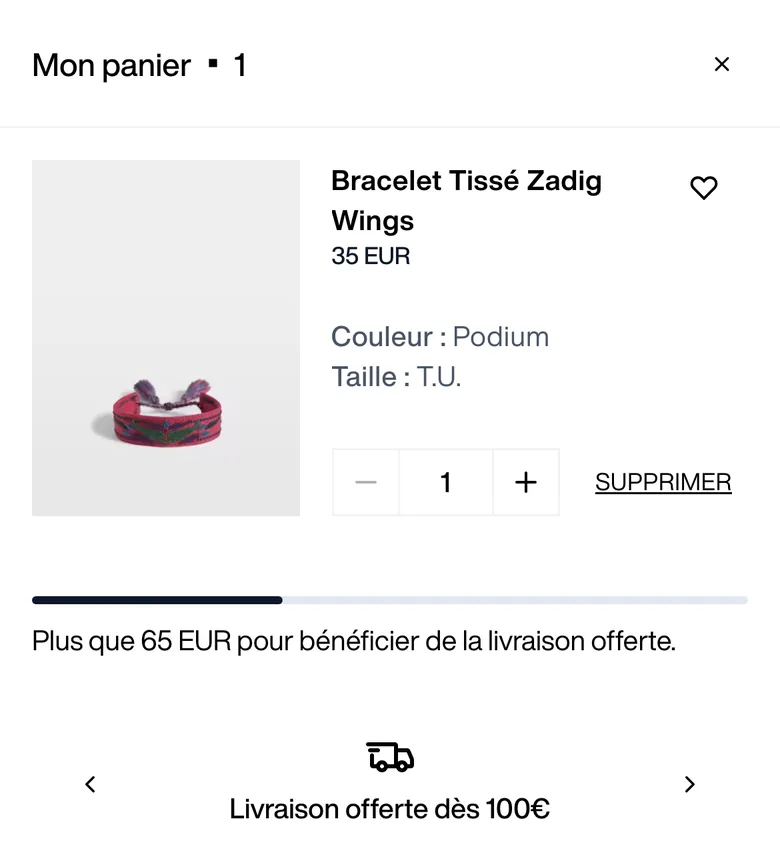
It is the kind of component that looks trivial and isn’t. The amount to reach is computed on the subtotal after discounts, not before. Gift cards and virtual products are excluded. The threshold is not hard-coded: it comes from each storefront’s configuration in Magento, so the e-commerce team can change it without a deploy. On markets operated by Global-e, where shipping follows other rules, the bar is hidden. And the message is announced to screen readers through aria-live.
INP, or how our site was slow without being slow
On the performance side, the alarm came from audits: INP (Interaction to Next Paint) was poor everywhere. 396 ms on the UK homepage, 543 ms on a product page, more than 1,000 ms on some product listings, against a “good” threshold of 200 ms.
First surprise: on our machines, we could not reproduce it. With a PerformanceObserver and Chrome DevTools traces, our measurements topped out under 100 ms. The gap came from the field: less powerful phones, a main thread already busy with tracking scripts, and interactions doing too much work before handing control back to the browser.
INP does not measure the total work triggered by a tap. It measures the delay until the next paint. Any work that is not needed for that paint can wait.
We applied that principle everywhere a user interacts:
- Yield before secondary work. Clicking a product tile starts navigation immediately, and the tracking event fires in a
setTimeoutright after. Same logic for filters and add to cart: visual update first, everything else next. - Run scroll handlers at most once per frame. The header that hides, the dark navigation mode over the hero, the “Filter” button that disappears: all of them go through a tiny utility, and every scroll listener is declared
passive. - Avoid forced layouts. A
getComputedStylein the size selector handler was replaced by a simple viewport position check. - Render less.
content-visibility: autoon product grid tiles, CSS containment on the footer, filter panel and product page tabs loaded on demand, deep watchers removed. - Respond before the server does. The wishlist heart fills instantly and only rolls back on error.
export function rafThrottle<T extends (...args: any[]) => void>(fn: T): T & { cancel: () => void } {
  let rafId: number | null = null

  const throttled = (...args: Parameters<T>) => {
    if (rafId !== null) return
    rafId = requestAnimationFrame(() => {
      fn(...args)
      rafId = null
    })
  }

  throttled.cancel = () => {
    if (rafId !== null) {
      cancelAnimationFrame(rafId)
      rafId = null
    }
  }

  return throttled as T & { cancel: () => void }
}
One idea did not survive testing: optimistic UI when removing an item from the cart. Quickly removing several lines, or removing a product right after adding it, showed an error message and a cart that would not empty. We dropped that optimisation: on a cart, correctness beats perceived speed.
The rule “scroll throttled with requestAnimationFrame and passive listeners” was also added to the project’s development guidelines, the ones read by developers and by the agents coding with them. A fix that isn’t written down somewhere always ends up being undone.
Tracking, the main thread’s biggest tenant
Third-party scripts weighed about 300 KB and 150 ms of CPU on every page. The heaviest was the GTM loader: 133 KB and between 229 and 290 ms of CPU. The consent platform, on the other hand, is a legal requirement and has to load early.
We deferred the GTM loader until Nuxt finishes hydrating. The dataLayer is initialised immediately, so events from the first seconds are not lost, but the script itself waits until the app is interactive:
window.dataLayer = window.dataLayer || []
window.dataLayer.push({ 'event': 'gtm.js', 'gtm.start': new Date().getTime() })
useScript({ src: `${source}?${params}` }, { trigger: 'onNuxtReady' })
A side lesson: in lab measurements on mobile, the largest element painted on our homepage is often neither an image nor a heading, but the text of the consent banner. LCP then becomes the time a third-party script takes to show up. Check which element is being measured before optimising the wrong one.
LCP: telling the browser what matters
On pages where the LCP is an image, the browser discovered it late and treated it like any other. On a product listing, the category banner took more than two seconds to render once downloaded.
Three fixes did most of the work:
fetchpriority="high"on the LCP image of each template (category banner, first hero slide, first product image), and neverloading="lazy"on those images;preconnecthints to the domains called during the first render;- image sizes that are finally right: the widths served by imgix were centralised in a set of constants,
sizesattributes fixed, and every component asks for the image it needs, not the original.
In parallel, every CMS slice and the heavy cart components (product zoom, recommendations, alerts) moved to lazy loading.
The hero video, or the story of three formats
Video was the textbook case of the year. The homepage hero is a muted loop a few seconds long. Back when we used the previous video host, it started instantly.
In March, the site learned to play HLS, with hls.js for browsers that do not support it natively. In July, videos left the previous host to be served as HLS from a video CDN. And then, a regression: on landing on the homepage, visitors saw a frozen frame for about two seconds before playback started.
The CDN was not to blame: it answered in about fifty milliseconds. The delay came entirely from the client-side startup chain.
The <video> element did not exist in the server-rendered HTML: it appeared in the component’s onMounted. Not a single byte of video was requested before the bundle had been downloaded, executed and hydrated. Then came 107 KB of hls.js, then three sequential round trips (the master manifest, the variant manifest, a first 611 KB segment) before the first frame. On large screens, adaptive bitrate also climbed to the highest quality: about 6 MB downloaded for a seven-second loop.
Another finding, purely editorial this time: the poster was captured at the fourth second of the video, on a different shot from the first frame. Even with an instant start, the switch from poster to playback would have looked like a jump.
We made the simplest choice: drop HLS for progressive MP4. Our videos are short, muted, decorative backgrounds, not content watched for minutes: adaptive bitrate served no purpose. Each video is now encoded into two MP4 renditions, small and large, with quality on par with the old bitrate ladder as checked with SSIM. For the seven-second hero on desktop, we went from about 6.1 MB to 2.6 MB.
The remaining challenge was starting the video without waiting for Vue, while serving a single HTML for all devices, since the CDN caches the page. The solution: render the <video> tag on the server without src, with both sources as data- attributes, followed by a few lines of inline script that pick the right one while the HTML is being parsed.
{
  const video = document.currentScript.previousElementSibling
  if (!video.checkVisibility || video.checkVisibility()) {
    const mobile = matchMedia('(max-width: 767px)').matches
    const poster = mobile ? video.dataset.posterMobile : video.dataset.posterDesktop
    if (poster) video.poster = poster
    video.src = mobile ? video.dataset.videoMobile : video.dataset.videoDesktop
  }
}
The braces keep the const declarations block-scoped, so a page can hold several videos without globals. The checkVisibility test avoids downloading the CSS-hidden twin when a template contains both a mobile and a desktop variant. The poster is preloaded in the <head> with fetchpriority="high", and Vue never touches the src and poster attributes: it only swaps the source if the window crosses from one format to the other.
In testing, the first video request went out 0.26 seconds after navigation started, answered with 206 Partial Content: the browser only downloads what it plays. It has all been in production since 15 September, and 145 existing videos were re-encoded the next day.
What we learned
- Test the checkout on a real phone, ideally a slightly older one. Half of the test feedback only showed up on an iPhone 12.
- A well-chosen quick win is worth a redesign. Seven template and CSS fixes, without a line of backend code, changed the feel of the mobile checkout.
- Lab and field measurements tell different stories. Our INP was good on our machines and poor for our customers. You need both, and to know which one to trust for which decision.
- For INP, the question is not “how much work?” but “what has to happen before the next paint?”. The rest can wait a frame.
- Tracking is a guest, not the owner of the main thread. Deferring it until the app is interactive loses no events.
- The simplest format is often the right one. HLS is built for long videos people watch. For a seven-second loop, a progressive MP4 starts faster, weighs less and removes a dependency.
- Anything that can start while the HTML is parsed should not wait for hydration. A few lines of inline script beat any component.